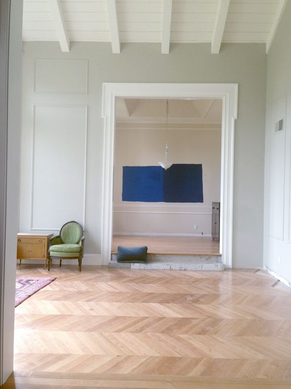
(someday my house will not be covered in a layer of construction dust)
Michael has a great eye and he has definitely become fluent in decorator-speak after years of hearing me yammer on about this stuff. He always has an opinion (and I love hearing his spot-on ideas), but he's also really flexible, for which I'm so grateful. He trusts me and is willing to sign off on most anything I am planning to do.
Because he trusts me so much and because I decorate our house as part of my job, he usually just lets me do my thing and chimes in when asked (except for the big decisions/purchases, of course). So I was a little surprised when out of nowhere he told me he would love to see blue lacquered walls in that little space next to the library we are planning to use as a music room... Uh, okay!!
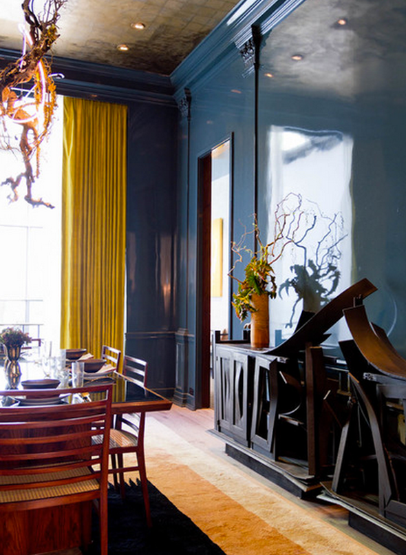
Miles Redd
Miles Redd
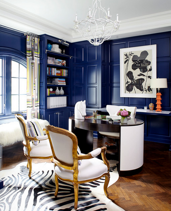
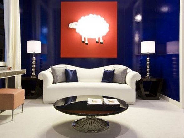
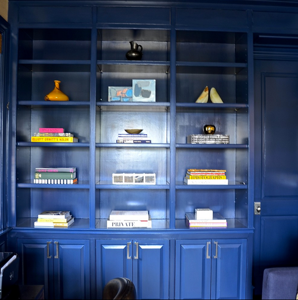
We pulled out my paint decks and I was showing him darker blues with a healthy dose of green (like F&B Hague Blue and Ben Moore's Gentleman's Gray), but he was drawn to more clear and bright blues.
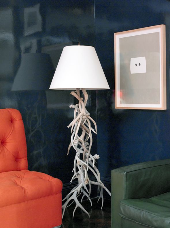
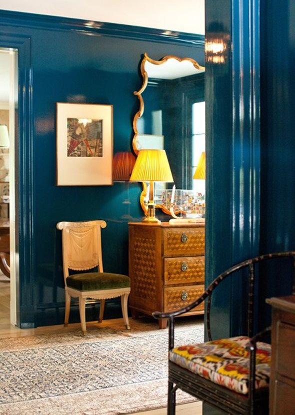
Miles Redd
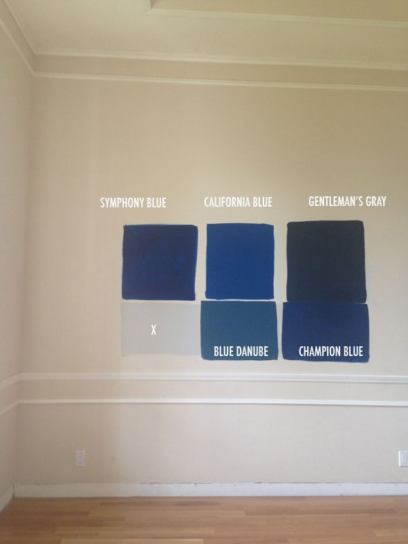
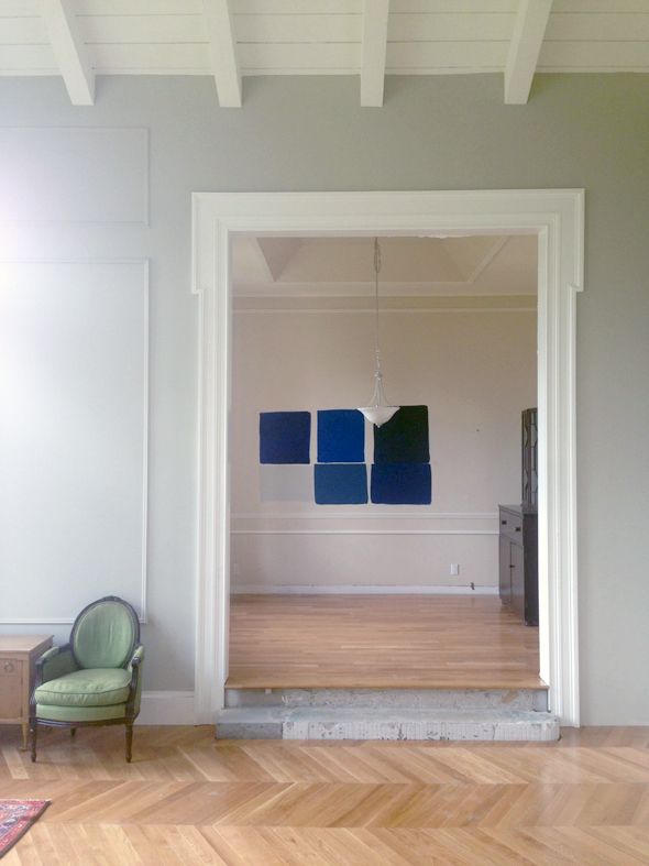
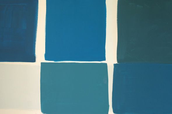
Pretty quickly I pulled out Symphony Blue because it was too purple in real life. Michael nixed Blue Danube (too green) and Gentleman's Gray because it was too dark (a fair point with all our dark paint projects in the house lately - mudroom walls, stairs, fireplace, bedroom walls...). We both were really drawn to California Blue and Champion Blue, so I painted out the other colors.
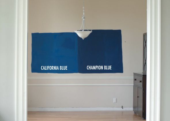
Michael says he'd be really happy with either choice, and I like both of them too. We bought a new vintage sofa a couple weeks ago that's a peacock blue velvet that I considered putting in the library, but now I'm thinking it will stay in the living room (some of you spied a sliver of it in this post). I like the idea that the bold wall color would be like a little preview of the sofa color.
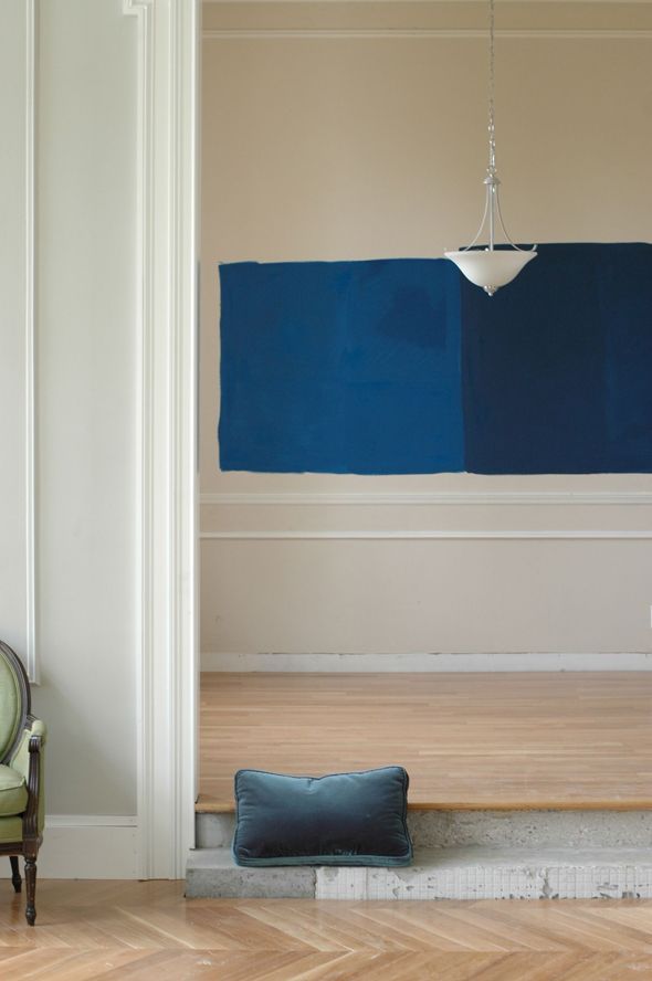
While I love the inky depth of color in Champion Blue, I think I'm leaning a bit toward California Blue, just because it would be fun to make a big statement in this really small space. There will be a big mirror in here probably and guitars on one of the walls, the camel leather Chesterfield, a piano and a rug to break it up, so the bright contrast might actually be really perfect. What do you think? I'm mostly just thrilled that Michael chose the direction and that he gets a room that's all his idea (for once!).
PS After I nail down the color choice, I'm going to do some experimenting on plywood with DIY lacquering vs just high gloss latex and I'll be sure to share what I learn. Lacquering walls is notoriously tricky, so this one might be a job for the pros.