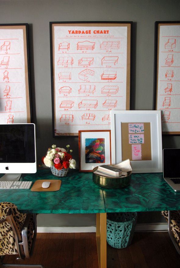
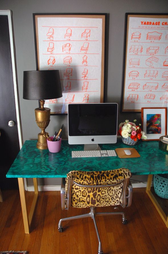
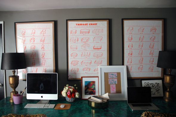
Originally I had grand plans of photoshopping out my favorite pieces from the various upholstery charts floating around the web (I posted a few of the ones I reference here) and making the lines a bright reddy orange and then taking the files to the printers.
I was inspired by these orange prints from the first season of Top Design on Bravo (remember that show from back in the day?).
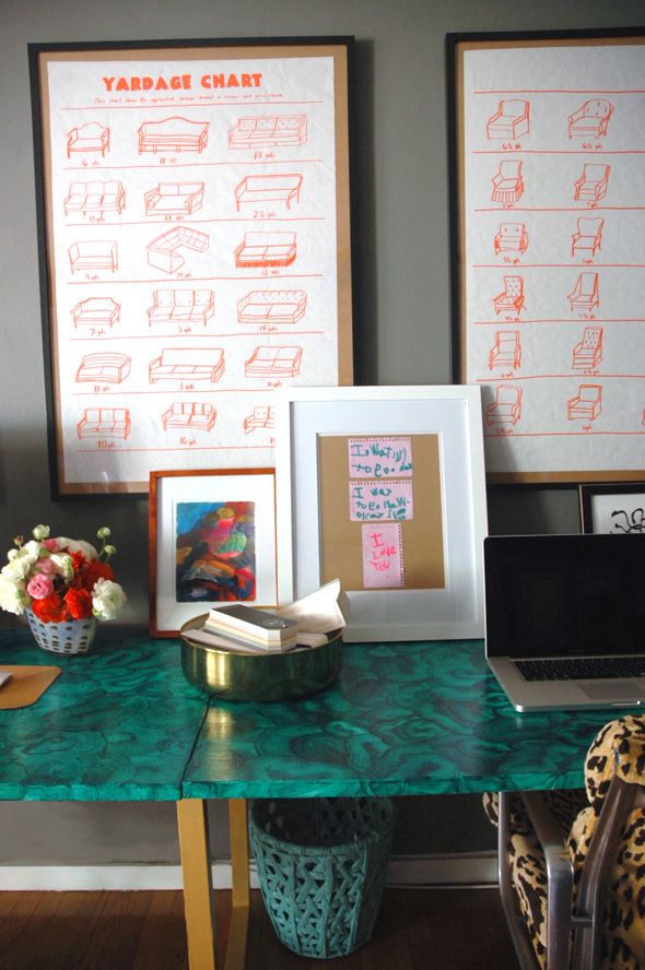
I have plans to go back and redraw them all because I like the concept a lot, but I started to get pretty sloppy with the execution by the third poster (the one with the sofas). Also, most of the pieces I drew were straight from the old upholstery charts which (I realized in the middle of my time crunch) were pretty generic (read: boring). But how cool would it be to do real iconic furniture pieces, or even some of the new pieces currently available online and in stores? I'd happily spend an afternoon sifting through 1st Dibs listings to get an inspiration file going!
The frames are just black IKEA Ribbas with the mats removed. I mounted the butcher paper right on to the chipboard backing using double-stick tape. (That's my signature secret move when custom framing/mating is not in the cards. I actually have come to really like the brown addition from the chipboard. I know that sounds a little cheap and weird but I've found the natural brown adds a surprising color element most of the time? Anyway, it works in a pinch.)
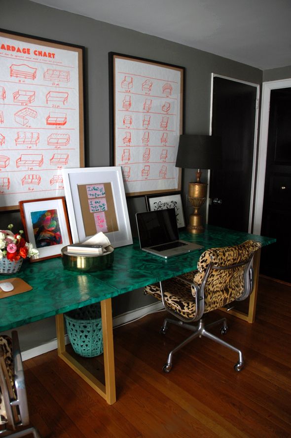
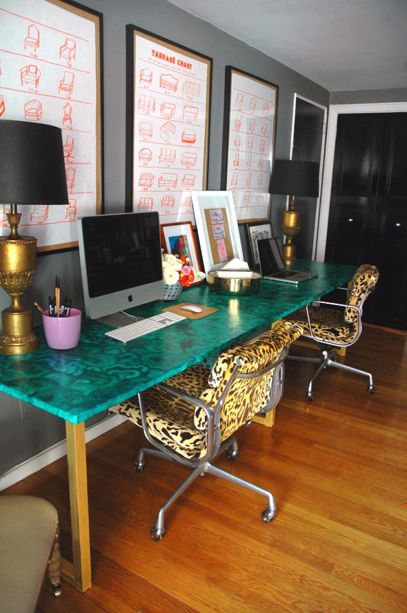
I'm happy with the way these posters look on the dark gray walls. They probably would have been lost on a lighter wall color. Though it's a given that I'll always love orange and gray together.
Info on items in this post (feel free to ask if I missed anything):
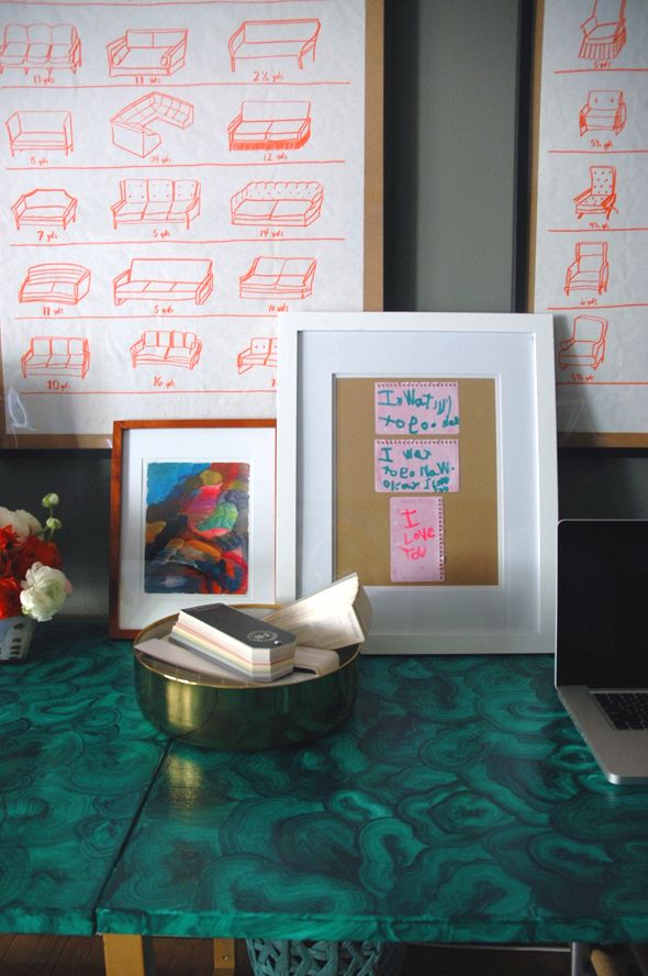
Gold bowl for storing paint decks (I need to buy like four more of these bowls before they sell out, they're my favorite)
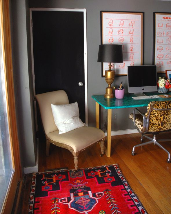
Persian rug in front of back door