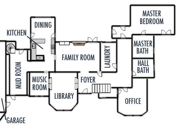
Like with every house, there are some funny quirks in this place, but for the most part I love how our new house is laid out. A part of me is dying to just get in there and get started, but we're really enjoying our last couple of weeks here in New York, so I'm not actually thinking about the new house too much. (PS some of you emailed about renting out the brownstone and luckily we found another family about 12 hours after we listed the house on Craigslist a couple weeks ago, which was a huge relief. I'm glad another family gets to enjoy this space and the yard we worked so hard on.)
So like I mentioned earlier, I'd love to share the new house with you in its before state, room by room. Might as well start at the entry. Here's the front door again:
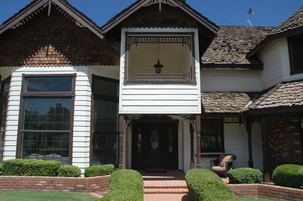
And as a reminder, I'm planning to rip out that faux balcony situation so you can actually see the front door from the street better. I might need to leave something up high for the roofline and for shade, but I'll figure that out later.
Wouldn't that green color from yesterday's post be so pretty on a new door? I'll probably have to keep this one for at least a little while, so I'm thinking I'll just paint it out and see how I like the color before committing to it on the new doors.
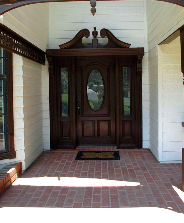
Then here's the front door from the inside. The previous owner, who is just about the nicest a person could be, actually spent a lot of money on the house, getting it just how she liked it before putting it on the market to move into her new-build home. The look is actually pretty tame for most of the homes you see in Arizona (which almost across the board aren't at all my style). The ceramic tile here in the front of the house is about the worst offender, but everything (including the tile) is an easy fix. The things that weren't easy or even possible to fix with most Arizona houses weren't an issue with this home. Things like having smooth, not highly textured walls, really high ceilings without plant shelves and good, but not super-scorcher light with north/south exposures - these were all here with this house. I feel like I won the AZ lottery in that the house needs work, but the work it needs is just perfect for us.
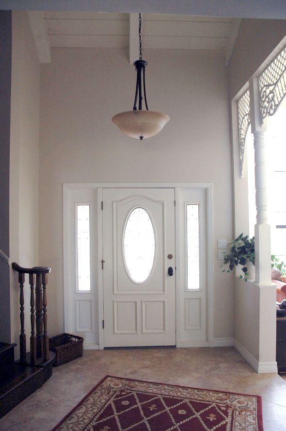
You can see some of the gingerbread moulding continued on the inside of the house (awesome), but I'll talk about that when we get to the library post. Here's the view as you walk in the front door.
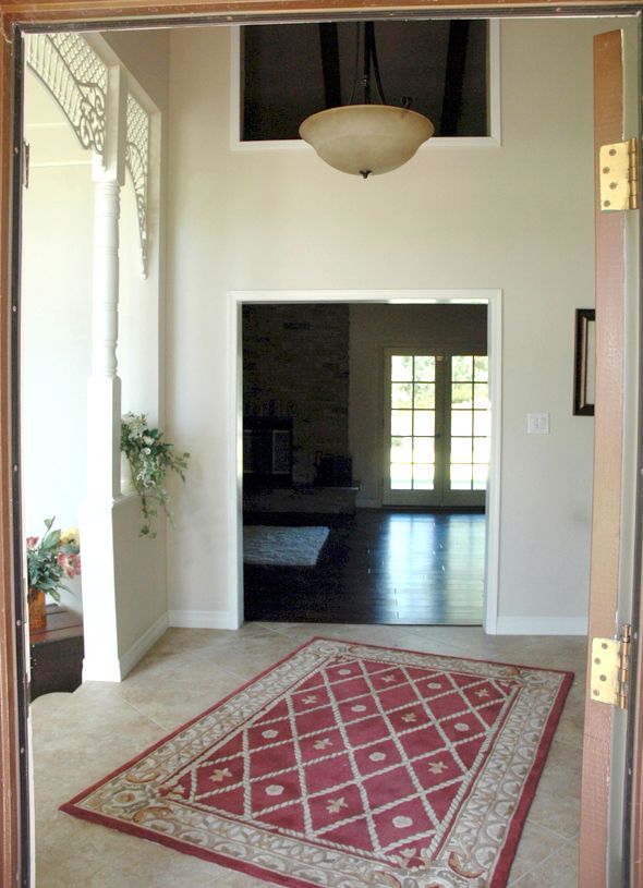
This is one of the walls that I want to rip out and rebuild. I can't stand that picture window cut out above that low walkway. We're looking into how much we can change the opening there without having to do major electrical work.
Also you can see here how the owner put in dark wood floors in the family room. The tile is just in the entry and hallway and the front common rooms. Probably only about 800 square feet of tile and the rest of the house is that dark wood, with the exception of the playroom/guest suite area on the other side of the house, which are carpeted.
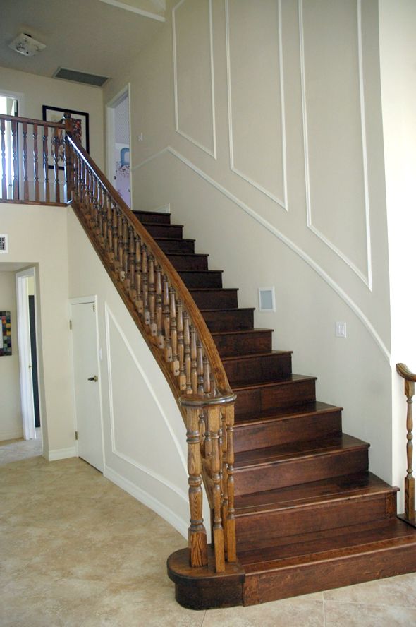
I'm going to do a separate post on the floors, because there's a lot to say there, but the operating plan is to replace everything now, before we move in our furniture. I care more about the floors than about putting in a new kitchen right away, just because it's so hard to change all the floors down the road while actually living in the space. And I think beautiful floors really just set the tone for a home. Anyway, more on that later.
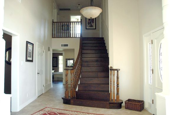
The stairs will get a fresh coat of black and white paint and I think that will go so far! I'm still debating whether or not to do a runner on the new wood we'll be putting down, but it's probably a good idea with the kids. (those are their bedrooms upstairs)
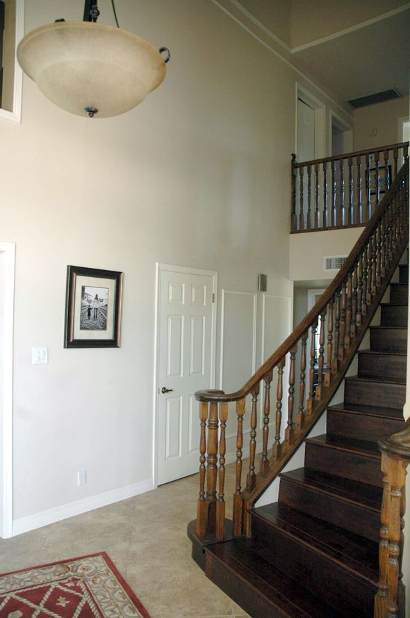
I think the previous owner was starting a paneling project that was never finished. (see those two boxes next to the coat closet?) I'd love to do something similar on the walls in here, but with an even more dramatic moulding. Also all the moulding and floor boards will be replaced when we do the floors and I'd love to replace the doors while we're at it, but we will probably need to wait on those. I might just do my old trick of painting them black to take away from the hollow-core look.
So, a recap of my entry plans:
- Paint the front door exterior a fun color, like jade green.
- Replace front door eventually with a taller, more modern double door. Maybe something with glass to bring in more light.
- New wood floors on the stairs and to replace all the ceramic tile
- Maybe a stair runner
- Paint the stair rail black and the balusters and stair risers white
- New entry light (something really big and unique)
- Strip and stain the ceiling beams?
- Rip out and reframe the entryway into the family room
- Trim out the walls with paneling
- Replace the door frames and floor boards with more substantial mouldings
- New solid wood doors eventually, but paint the existing doors black until then
- Cool rug in front of the door
- Hang a mirror and maybe a small, wall-mounted console table next to the coat closet
- Paint the walls - maybe a glossy white on the paneling? Would help it feel brighter for sure.
What do you like to see in a home's entry way? I think it's such an important space! For visitors, it's like a little summary of your home style.