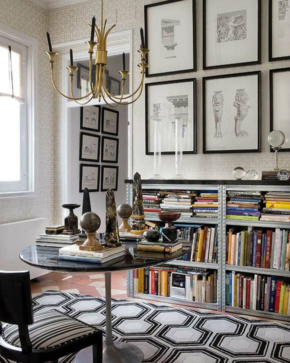
This little library by Raul Martins is chock full of great design ideas, so let's get started!

Replace the shades on this chandelier with black shades, to repeat the black and gold motif.
A grouping of crystal balls on a bookshelf looks ever so chic.
Look closely and you'll notice these shelves are industrial shelving units, topped with a black marble slab. Such an excellent storage solution!
Framed architectural sketches are so fitting for a library. Botanical diagrams would be lovely too.
More intriguing objects for a grouping!
I firmly believe a library shouldn't have too-comfy chairs, otherwise you end up snoozing more than reading. It's for your own good!
A book on which to place an obelisk.
You could buy a Tulip Table with a black marble top, but I actually prefer the contrast of the white table.
Here's another brilliant design trick: the wallpaper pattern mimics the one on the rug, but it's low contrast, allowing the rug to take center stage. Repetition: your design friend.
A high contrast geometric rug punctuates the repetition of black throughout the space.
PS More Copy Cat post here.
PS More Copy Cat post here.